

Designer Researcher StRATEGIST
Designer Researcher StRATEGIST
About Me
I’ve worked in the UX world for 7 years, specializing in product design, user research, and product strategy. I’ve helped startups, agencies, and nonprofits solve complex problems and launch products that have served millions of people.
I’m passionate about making technology accessible to everyone, expanding access to education, and combating climate change. I believe that consistently measuring impact, storytelling, and listening to users are some of the most powerful tools a designer can wield.
When I’m not in a flow state designing or talking to users, I enjoy playing board games, discussing big ideas, making bad puns, and scooting around the city with my dog.

Recent Work
I love taking on complex problems and using research to drive design decisions.
Recent Work
I love taking on complex problems and using research to drive design decisions.
Projects

Digital Ap Exams
Helping Millions of AP Students Prepare For College
Digital Ap Exams
Helping Millions of AP Students Prepare For College
THE CONTEXT
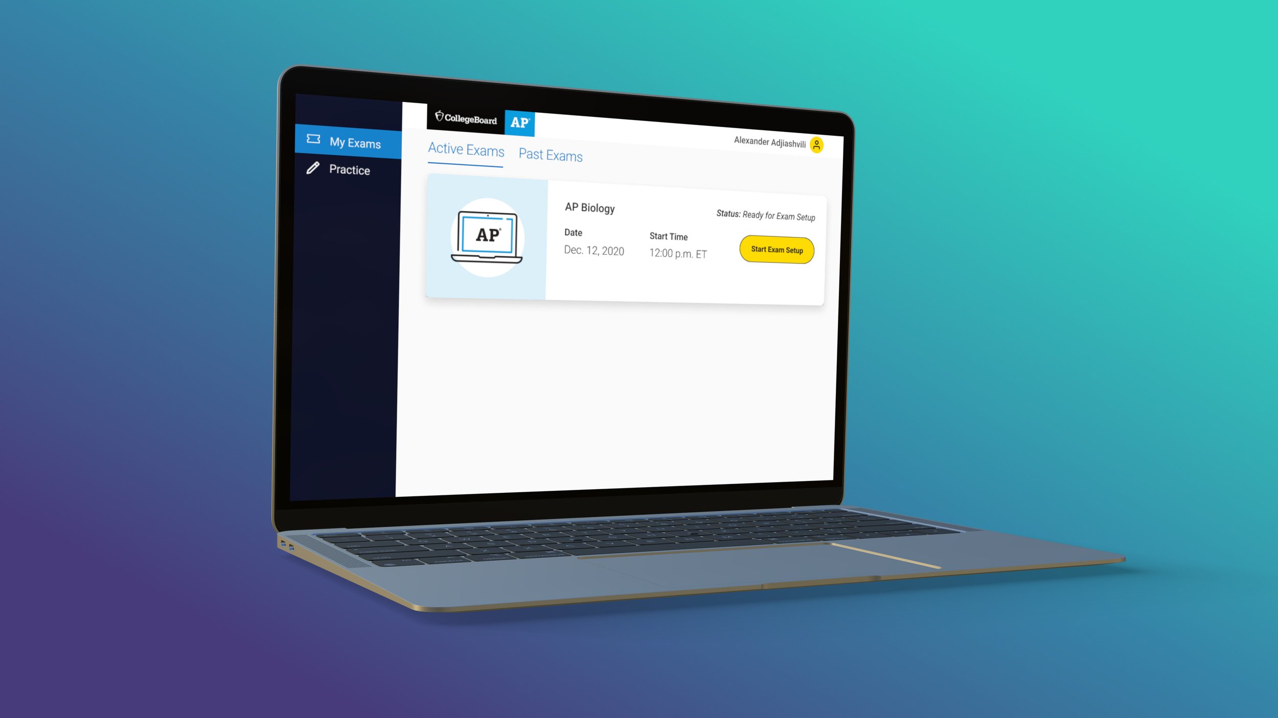
In 2020, spurred by the pandemic, the College Board delivered the AP exams digitally for the first time. For 2021, colleges wanted the exams to return to their full, 3-hour length, which posed challenges for test security and student connectivity.
GOALS
Ensure successful answer submission
Increase the security of the exam
Create a simple, usable test experience
My ROLE
Title: Senior User Experience Designer & Researcher
Timeframe: 9 months
UX methods: Design workshops, user flows, wireframes, prototypes, usability testing, user interviews, A/B testing, competitive research, surveys, and more.
Team: I was lucky enough to work with a talented team of two other UX designers, a content strategist, a product manager, and more than a dozen developers, as well as executive stakeholders.
Preventing Technical Issues
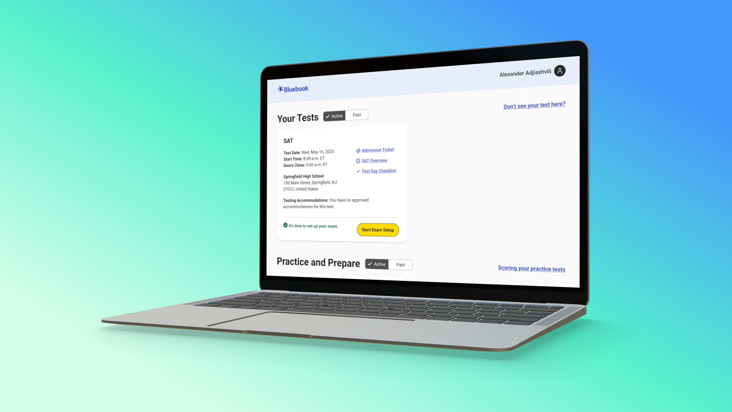
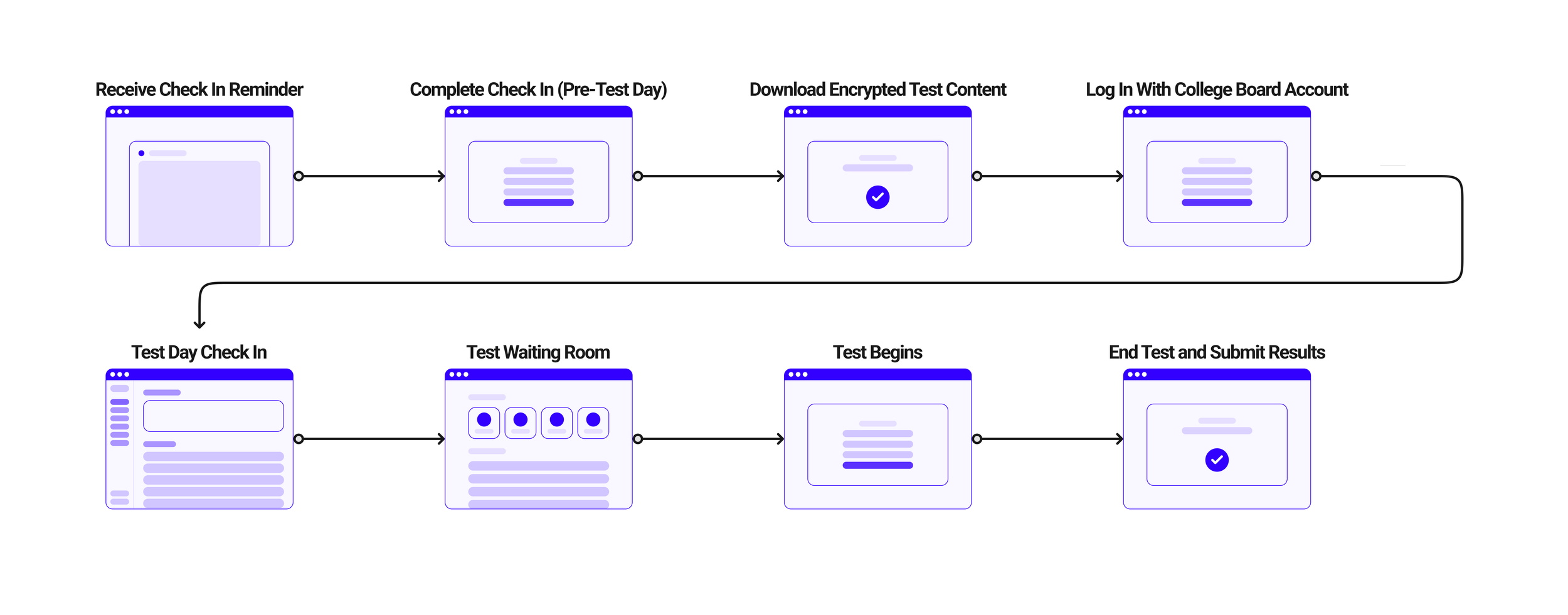
We kicked off with a Google Ventures-style 5-day design sprint. We focus on the pre-test “check in” as the key moment in the student journey to build and test. This moment presented the best opportunity to help students avoid preventable mistakes such as a computer battery dying during testing, or discovering that their device’s camera wasn’t working.
DESIGNING AT THE MARGINS
The proposed feature with the most security benefits for at home testing was monitoring video and audio in the room during the test. I had serious privacy concerns, but students were more worried about others cheating.
However, streaming this data could also strain home Wi-Fi connections, so in a survey of 20,000 students, I included an interactive internet speed test that helped us learn that 2.7 percent of students had speeds that were too slow to support this feature, so it was scrapped.
WHEN BUSINESS NEEDS AND USER NEEDS CONFLICT
With audio and video monitoring ruled out, the business felt the need to do something major to increase confidence in test security. They settled on not letting students go back to a question after they answered it.
We had evidence that students would hate this, but the business viewed it as non-negotiable. The stakes were high. For students who knew about this constraint, it would be stressful, for students oblivious to it, it could be catastrophic.
I hypothesized that adding the checkbox would increase comprehension, but was pleasantly surprised that it reduced time on task as well.
We designed a confirmation modal that let students know about this constraint and ran A/B testing with 864 students with the goal of maximizing comprehension and minimizing time on task. As a result, 90 percent of students in the post-exam survey said they were aware that they couldn’t go back on the test, and we didn’t get a single customer service complaint about a student being caught unawares.
CRAFTING A SIMPLE, LEARNABLE TeST INTERFACE
Through in-person observations, interviews, and surveys, we gathered extensive student input on student behaviors and preferences related to common testing features. I distilled these into three values that guided our decision making around each new feature. The interface should be Learnable Discoverable Focused
It was an equity issue that the test UI should be just as intuitive for a student first seeing it on test day, as for one who had been practicing for weeks. Here are three key features and the insights we gained about them:
1. KEEPING TRACK OF TIME
Many students loved the timer and many hated it. But even for those who hated it, it was critical that they not lose track of time. The compromise we struck was to make the time prominent but also easy to hide. Except in the last 5 minutes of testing so students know their time is almost up.
2. highlighting and Annotation
The rollout of the annotation feature was a major mistake that haunted me, but which I was able to learn a lot from. I did competitive research of other testing applications and productivity tools with similar features, created a prototype and ran usability testing sessions with students where the feature was well received. I invited developers to observe the usability testing, but I hadn’t run the prototype by them beforehand. As a result, we had to reduce the feature’s scope without having a chance to test it again. The biggest complaint about the design we shipped was that the process of creating notes and highlights took too long and needed to be simplified.
3. submitting the answers
We made a decision early on that shaped much of how the app was built: students would download the encrypted exam ahead of time so that they could continue to test with little to no internet. This meant though that at the end of the test, they had to have internet connectivity to successfully submit. Through some iteration and a lot of detailed content work with the content strategist, stakeholders, and developers we were able to clearly communicate to students how to troubleshoot this situation, and give them ways to submit their responses up to 5 days after the test was over.
THE IMPACT
* We removed the “no going back” constraint, made other improvements, and the team was able to increase this metric to 95% of students reporting the app was easy to use while more than doubling the volume of students testing.
In the end we were able to launch the testing app supporting 20 digital AP subjects and help 1.8 million students who might have otherwise been unable to test. Despite the wide range in students’ socioeconomic backgrounds, connectivity, device quality, and home environments, an incredible 99.97 percent of students were able to submit their answers successfully. But we didn’t have long to bask in the successes of the launch because it was time to build out features to support in-school SAT testing in the app. But that’s a story for another case study 😊.

Bond
Simplifying the process of sending thoughtful, handwritten notes.
Bond
Simplifying the process of sending thoughtful, handwritten notes.
The Context
Bond is a company that makes it easy for people and businesses to send personal, handwritten notes by mail. Customers choose a stationery, compose a message, then Bond writes it in pen and mails it. The company does this at scale by using robots that hold pens to write the notes.
When I began working at Bond, my first project was conducting UX research and UX/UI design for the launch of a consumer-facing mobile app. Before I came on board, there was a beta version of the app that was 90 percent coded but users struggled to understand the app's purpose or navigate it easily. As the first dedicated UX person at Bond, it was my responsibility to make the app easy to use and to advocate for the value of UX methods to other teams within the company.
The Problems
1) The User Problem - Current customers who used the website had repeatedly expressed interest in sending notes on-the-go.
2) The Business Problem - The team was given the business constraint that we had to build the app with a subscription pricing model.
3) The Design/Technology Problem - On mobile devices, with the limited screen real estate, we knew that showing the text of user's message in their chosen handwriting would be challenging.
My Role
I led the UX research for the app from 2016 to 2017, and two months into that time I took over the UX design for the app as well. I conducted surveys and user interviews, wireframing, prototyping, content strategy, competitive analysis, and documentation for the developers.
I worked closely with the head of product, a consulting UX designer, a visual designer, and a copywriter.
The PROCESS
I kicked off the research with a survey of nearly 200 current customers to deepen our understanding of user behaviors, paint points, and preferences. I also worked with the marketing team to dive into the analytics for the existing website to get benchmarks of user activity. The team's hypothesis was that the subscription business model would be our biggest hurdle, and that it would require us to help the user form a habit of thoughtful correspondence.
Key Findings: The two biggest obstacles people faced to sending a note were 1) not having enough time and 2) forgetting important occasions. While some users were pressed for time and wanted to send a note as quickly as possible, others preferred taking the time to customize the design of the note they were sending, so we had to cater to both sets of needs.
Features: To address the needs of our users who were pressed for time, I recommended offering as many default options as possible. Some things we built to address that need were: a robust selection of stationery designs, Google Maps to autocomplete addresses the user types, and saving drafts for when they get interrupted.
For users prone to forgetting a friend's birthday or an important anniversary, we anticipated that we'd have to connect to some other platform where they stored that information, whether Facebook, LinkedIn, Google. Talking to customers further reinforced the value that would provide and the native iOS calendar started to look like the best place to pull important events from. But to build the app by our deadline, we couldn't incorporate calendar integration. So in the interim, we created a digest of cards that would populate the user's home screen over time. Each card would offer a prompt for a different occasion or opportunity to reach out to a friend or loved one.
The digest prompted users with different occasions for sending notes to others. If they weren't interested, users would swipe the card to dismiss it.
Key Finding: In my research I discovered that the company's users skewed heavily male, but that women sent twice as many notes through our website. In user interviews, many people, but particularly women, told me that it was their mothers who'd ingrained in them the importance of sending thank you notes. Armed with that knowledge, we didn't know why the service wasn't attracting more women as customers. One theory was that the idea of using robots to send a note was off-putting or felt less personal to them.
Result: I was able to work with the marketing team to figure out that by targeting our ads based on cohorts similar to our early customers, we'd skewed the gender balance of who was being driven to the site by our marketing channels. Both the qualitative and quantitative evidence suggested that this was a tremendous missed opportunity to reach many women who were already strong believers in sending handwritten notes.
Key Finding: From doing remote usability testing, I found that people unfamiliar with the company often didn't understand that the notes Bond lets people send would be physically written and mailed. This had a major impact on both their comprehension of the service and their perception of how much it should cost.
Result: At various points in the compose and customization flows, we introduced animations that made it clear to the user what part note they were working on at any given moment and how it fit into the larger picture. We also increased the use of photography in the designs to showcase that we were using real stamps and to highlight the reactions of recipients when they received the note. Finally, we added a brief illustrative video to the app's home screen to explain briefly and clearly how the notes were made and sent.
This video shows the animations when a user looks at both sides of the stationery and when they begin composing their message.
UI Design
Below are a few examples of before and after screens to show how we iterated on the app based on user feedback over time.
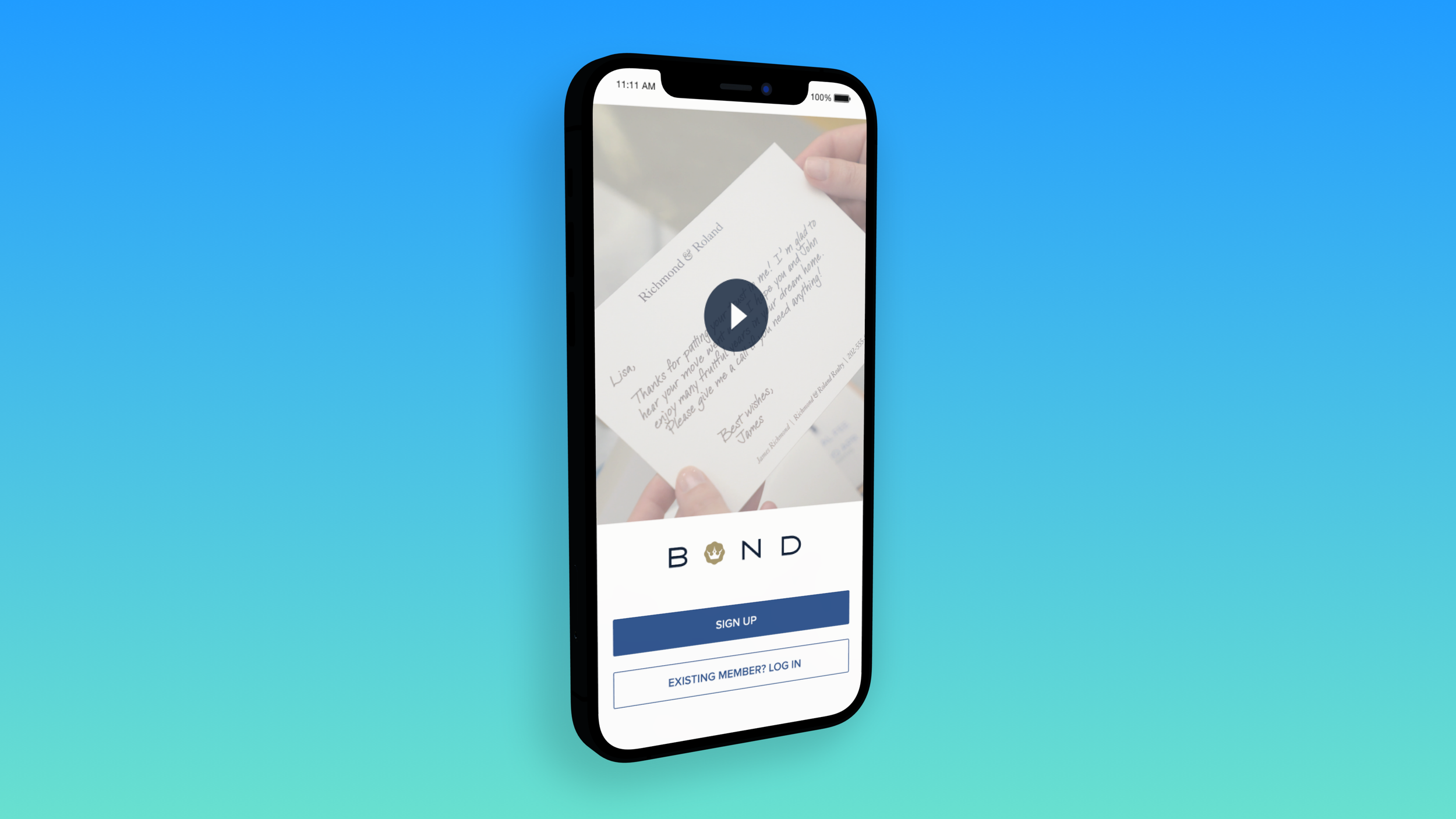
Sign Up (Before and After): Since some testers struggled to comprehend the service and the physical nature of the product, that made it challenging to articulate the value proposition with microcopy. The screen on the right shows a still from a video that improved qualitative comprehension of the service and the percentage of people who signed up. One advantage of a native mobile app over a responsive web app was that it gave us the ability to let users send their first note for free and keep better track of who had already sent a free note.
Left: An early wireframe for the signup screen. Right: A much later version that used a short video to explain the service users.
Text Customization (Before and After): A core way in which users can customize their note is by choosing a handwriting style. In interviews I found that users tended to either choose a handwriting style that looked like their own, or an aspirational style that looked cleaner and clearer than theirs. Users often confused the handwriting styles with fonts, but the important distinction, which I recommended should have more prominence in Bond's brand messaging, was that there are many unique instances of each letter, which gives the notes a more authentic feel. For example, if I wrote the word "Alabama," each instance of the letter "a" would look different.
In the screen on the left, users see a preview of different handwriting styles using the pangram "The quick brown fox jumps over the lazy dog." Then users would go on to write their message in plain text before seeing it again in the style they'd chosen. This was confusing to people, and the team felt that we could improve on that experience.
The ideal state would have been for users to see the note in in their handwriting style as they typed it. However, given the limited screen space on mobile (with the keyboard taking up half the screen) and the added value of typing in plain text (you can cut and paste, select, use autocorrect, etc.) we had to divide the typing of the message and seeing a preview of it in a handwriting style into two separate screens. In the screen on the right, users have the chance to select a handwriting style after they've finished composing their message. In user testing, people expressed surprise and delight when they saw their message transform from plain text to handwriting.
Left: An early design let users pick a pangram (which uses all the letters in the alphabet) to preview different handwriting styles. Right: By having the user select their handwriting style after composing their message, it creates a delight moment when they get to see their plain text transformed.
Before and After (Visual Customization): During testing of the earlier design on the left, users expressed confusion about the navigation options at the top of the screen. The design also didn't cater to the thumb zone since the primary calls to action were at the top of the screen where the user couldn't comfortably reach them. Finally, it restricted users to viewing one side of the stationery at a time. This resulted in them having to click many more times if they were interested in seeing both sides of the note.
In the updated design, we made sure to keep the button that advances the user to the next step in the process within easy reach at the bottom of the screen. We also simplified the pattern for exploring different categories of stationery into a segmented control with only two options. Designer was intended for users in a hurry who want something that had been "taste tested" for them and Personalized was for people who preferred taking the time to make something their own with a photo or a logo.
Left: In the screen on the left users could only see one side of their stationery at a time. Right: The design on the right made it easier to preview both sides of the stationery at once while still getting a preview of other available stationery designs.
Lessons Learned
I learned so many valuable lessons about Bond's users, and many of those lessons helped shape the direction of the company's roadmap. Here are a few high-level things we learned:
1) The importance of cross-platform consistency - The mobile app was an experiment in many ways, so it wasn't built to have feature parity with the company's website. However, this created confusion for users and collecting feedback that came in through customer support channels helped us catch these points of confusion early and course correct to create a more uniform experience.
2) A wealth of future features - Conducting in-depth interviews surfaced many user needs that helped the company prioritize it's product roadmap going forward. Giving users easy ways to digitize their own signature or handwriting, collect addresses for the people they want to write to, or break past the pain of writer's block will help make the app even more valuable in the future.
3) Validating demand for a small business tool - On the app's subscription screen, we added a form so people who wanted more notes than the subscription plans offered could let us know how many notes they were interested in sending. The information collected from that form helped substantiate the demand for a tool that would let small businesses send notes to larger groups of customers as part of campaigns. The same feature had useful applications for non-business customers, such as making it easier to send family holiday cards or wedding thank you notes.


